When it comes to marketing, color isn’t just about aesthetics—it’s a powerful tool that can influence consumer behavior and brand perception. Understanding how colors interact and evoke emotional responses is key to building a strong, memorable brand identity. This is where color theory comes into play.
At its core, color theory is the study of how colors work together to create visual harmony. It goes beyond the basic color wheel and explores the psychological and emotional effects colors have on consumers. Let’s dive into why color matters in marketing and how you can use it to your advantage.
Why Colors Matter in Marketing
Colors play a critical role in shaping how consumers perceive a brand. They can evoke emotions, influence decision-making, and even drive action on a subconscious level. For example:
- Red signals urgency and excitement.
- Blue represents trust and calmness.
- Green symbolizes growth and health.
Effective use of color allows brands to forge deeper emotional connections with their target audience, leading to increased engagement and loyalty.
How Color Influences Consumer Behavior
By leveraging color theory in your marketing efforts, you can greatly impact how consumers respond to your brand. Here’s how:
- Evoke Emotional Responses: Different colors trigger specific emotions. Aligning your brand colors with the emotions you want to elicit can create a more profound impact on your audience.
- Enhance Brand Recall: Consistent use of specific colors across all brand touchpoints improves recognition. Colors serve as visual cues that help consumers quickly recall your brand when they encounter those shades again.
- Stand Out from Competitors: In crowded markets, unique color choices can differentiate your brand and capture consumer attention. A well-chosen color scheme can make your brand instantly recognizable.
Now that we understand the importance of color, let’s look at some key ways to use color theory in your marketing strategies.
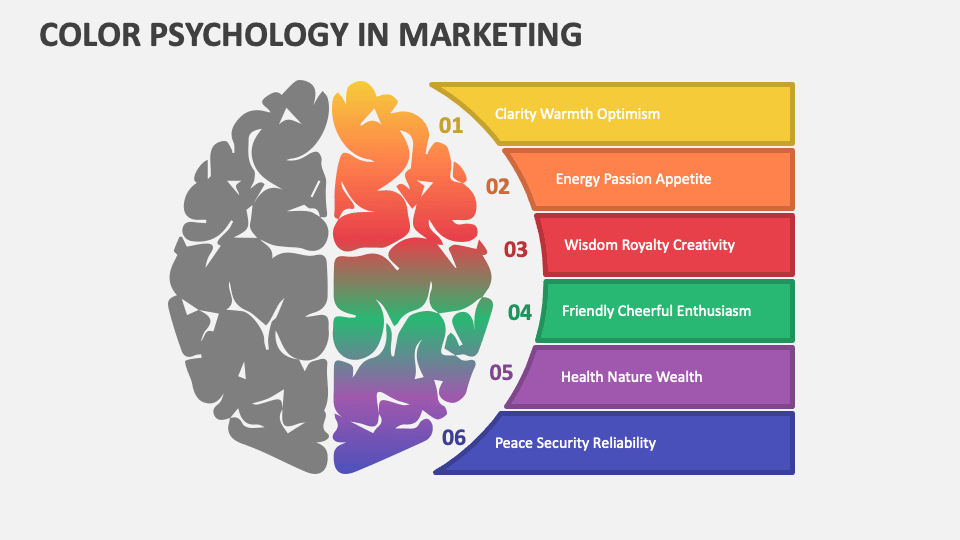
1. Harness the Psychological Power of Colors
Colors have the ability to evoke strong emotions, making them essential in marketing. By understanding the psychological effects of different colors, you can use them to your advantage in campaigns, branding, and product design.
- Red: Associated with passion, energy, and urgency. It’s used by brands like Coca-Cola and Red Bull to create excitement.
- Blue: Evokes trust, calmness, and reliability. It’s popular with financial institutions like PayPal and Chase.
- Yellow: Symbolizes optimism and happiness. Brands like McDonald’s use yellow to create a welcoming and cheerful atmosphere.
- Green: Reflects nature, health, and tranquility. Wellness brands like Whole Foods and Tropicana use green to emphasize sustainability.
- Purple: Represents luxury and creativity. Brands like Cadbury use it to convey sophistication.
- Black: Conveys power, elegance, and modernity, as seen in brands like Chanel and Nike.
- White: Represents purity and simplicity, often used by tech companies like Apple to emphasize minimalism.
When crafting your marketing campaigns, choose colors that align with the emotions you want to evoke in your audience. This can create an emotional resonance that increases consumer engagement and loyalty.
2. Establish a Strong Brand Identity with Color Consistency
Consistency in color use is essential for creating a cohesive and recognizable brand identity. By maintaining a consistent color palette across all brand touchpoints, you reinforce your brand’s visual identity and make it easier for consumers to identify you.
- Enhance Brand Recognition: Think about iconic brands like Coca-Cola and Tiffany & Co. Their distinct colors have become synonymous with their identity.
- Build Trust: Consistent use of colors signals reliability. When consumers repeatedly see the same colors associated with your brand, it fosters a sense of familiarity and trust.
- Stand Out: A unique and consistent color palette can set your brand apart from competitors in the marketplace.
To create a strong and consistent color identity, define your brand’s core values and select colors that reflect those values. For example, if your brand is eco-conscious, greens and earth tones might be the best fit.
3. Use Contrast to Drive Action
Contrast is an essential element in design that helps direct attention. By using contrasting colors effectively, you can guide your audience’s focus to specific elements, such as call-to-action buttons.
- Highlight Key Actions: Use bright, contrasting colors for your call-to-action buttons to make them stand out and encourage clicks. For example, Spotify’s green “Sign Up” button on a dark background draws immediate attention.
- Improve Readability: Ensure there is enough contrast between text and background to enhance readability and keep users engaged.
Keep in mind that too many contrasting elements can overwhelm the viewer, so stick to a limited palette to maintain visual harmony.
4. Consider Cultural Differences in Color Perception
Color meanings vary across different cultures, which is important to consider for global marketing campaigns. For example:
- Red in Western cultures often symbolizes passion and energy, while in Eastern cultures, it represents luck and prosperity.
- Blue conveys calmness and trust in many Western societies but can signify mourning in certain Eastern regions.
Before launching a global campaign, take time to understand how different cultures interpret colors. This ensures your messaging is not only relevant but also respectful to local customs and preferences.
5. Test and Optimize Your Color Choices
No matter how well you plan, color strategies need to be tested and refined over time. A/B testing can help you understand which color combinations perform best with your audience.
- A/B Testing: Use tools like Google Optimize to test different color variations in your marketing materials and track the results.
- Analyze Performance: Evaluate how color changes impact key metrics such as click-through rates, conversion rates, and engagement.
- Refine Your Strategy: Continuously optimize your color choices based on performance data to ensure your marketing efforts remain effective and relevant.
Conclusion
Color is a powerful tool in marketing that can influence consumer behavior, evoke emotions, and strengthen brand identity. By applying color theory strategically, you can create a compelling visual identity that resonates with your audience, drives engagement, and boosts your brand’s overall impact.
To get the most out of your color strategy:
- Leverage the psychological power of colors to influence emotions.
- Ensure color consistency across all brand touchpoints.
- Use contrast to guide attention and encourage action.
- Be mindful of cultural differences when marketing globally.
- Continuously test and optimize your color choices for the best results.
With the right approach, color can be one of your most effective tools in building a successful, memorable brand.
